
This blog is part two of a multipart series on managing views, dashboards, and charts in Dynamics 365 for Customer Engagement. Part one discussed creating a personal view. This blog entry is about understanding charts in Dynamics 365. The next part in this series will discuss dashboards. We will then conclude our series with a culmination of how to share views, dashboards, and charts with other users in your organization
What are Charts in Dynamics 365?
Charts and other visualizations in Dynamics 365 are excellent tools for seeing the big picture in your system’s data. Most data in Dynamics 365 is surfaced in views – but views can hide important and subtle details. For example, I can view a list of 250 opportunities. But if I want to easily see what opportunities will be closing this month or next, who my top salespeople are, or how many phone calls per opportunity are being completed, there is no better tool than a nice chart!
Any table can have multiple charts, but only one chart at a time can be displayed beside a grid. Looking at multiple charts at the same time requires a dashboard.
Personal vs. System Charts
- System charts – these charts are owned by the organization and cannot be assigned or shared. These charts can be edited by system administrators or system customizers. Dynamics 365 comes with several out of box charts for the most popular tables – including leads, opportunities, contacts, accounts, and cases.
- Personal Charts – Any user with sufficient security can create their own charts and visualizations. Once created, these personal charts can be shared with others Dynamics 365 users. They can also be added to personal dashboards
Types Of Charts
Charts in Dynamics 365 can be classified as one of two types of charts : Single-series charts and multi-series charts.
- Single-series Charts – Single-series charts are visualizations that display data with a series Y value mapped to a category x value.
The most common types of single-series charts include:
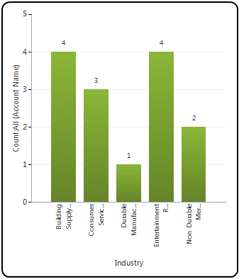
Column Charts – show data in vertical columns.
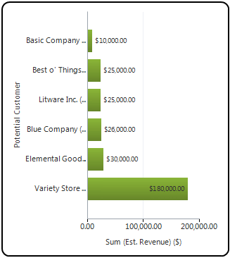
Bar Charts – show data in horizontal columns.
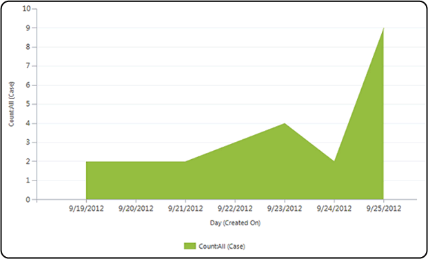
Area Charts – used to show cumulative totals over time.
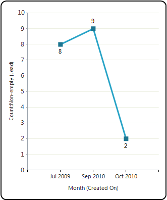
Line Charts – show individual points on a graph that are joined by a line. Line Charts might be used when looking at trends over a period of time.
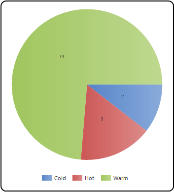
Pie Charts – show data as pieces of pie. A pie graph might be used to show numerical proportions of data.
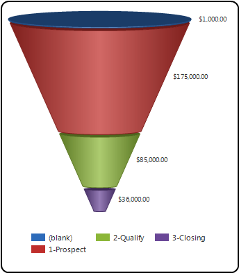
Funnel Charts – show values as progressively decreasing proportions amounting to 100% in total. A funnel chart is commonly used to show the sales pipeline.
Other types of single-series charts that are not quite as common include bubble charts, radar charts, tag charts, and doughnut charts.
2. Multi-series Charts – Multi-series charts are visualizations that display data with multiple series values mapped to a single category value. You can combine different compatible chart types in a multi-series chart.
There are two types of multi-series charts: a stacked chart and a 100% stacked chart. Both types of charts are comparison charts (particularly helpful when you are comparing two sets of data).
Stacked Chart – vertically displays data with multiple series values mapped to a single category value.
100% Stacked Chart – compares the percentage that each series contributes to a total across categories, Different compatible chart types can be combined (such as bar and line or bar and column).
Creating a Personal Chart
When creating a chart, there are a few things to consider such as:
- Deciding what type of chart you want to make.
- Whether you want the chart to be available throughout the organization or so you want more control over who can access it? If you want more control, you might want to consider creating a user-owned chart.
- You also must first specify to underlying data for the charts and how you want them to appear.
- And whether you want it to be a multi-series chart or a single-series chart?
To create a chart, follow these simple steps:
- Open the table you wish to create the chart for – for example – opportunities.
- Click on the “Show Chart” button in the ribbon
- When the charts display, click on the three periods in the right side of the chart pane
- Select + New – The chart designer will open in another tab.
- Define the properties from the chart.
- Name of the chart
- View used to preview the chart – for example – My Open Opportunities.
- Type of chart – Bar, Funnel etc.
- Horizontal and Vertical Series – the data that you wish to view
- To save the chart, select Save in the chart designer.
- Close the chart designer when complete and refresh Dynamics 365 to view your chart from the related entity
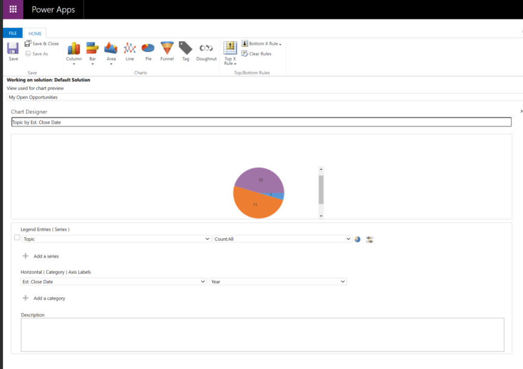
Below shows the chart designer showing creation of a pie chart of my open opportunities by estimated close date.
Viewing and Understanding Data in Charts
The true value of charts is in the analysis. Charts in Dynamics 365 provide businesses with valuable insights to help them in making important decisions for their organization.
Charts update automatically to reflect and filtering on the data in the grids. Similarly, when a drill-down operation is performed in a chart, the data in the grid is also updated.
Drill down in a chart
If you want to filter chart data for a certain segment, you can drill down into that segment of the chart. In addition, the chart type may be changed as you drill down.
- Open the list of records you want to chart, select the chart bar to the right of or above the list of records.
- Select the Charts area.
- In the chart area, select the arrow next to the chart name, and then select the name of the chart.
- Select the category area of the chart you want to drill down into.
- In the shortcut menu, select Select Field, and then select the field to group by.
- Select the button for the chart type.
- Lastly, select OK.
Editing and Updating Charts
Editing a chart in Dynamics 365 is simple. The process is very similar to creating a chart. There are just a few steps involved:
- Go to the Chart Designer
- On the right side, select the Charts pane.
- In the chart area, select the chart list. Once you’ve selected the chart you want to edit, select the Edit Chart button.
In Conclusion
As you’ve seen, charts allow businesses to view large quantities of data in a more insightful way so that they can make more impactful business decisions. If you need any assistance incorporating charts into your Dynamics 365 dashboards, do not hesitate to contact the experts at enCloud9.
How Can We Help?
We have years of experience helping companies like yours increase sales, revenue, and productivity. If you are not already using Dynamics 365, we can certainly get you started quickly with one of our Accelerators. Accelerators are prepackaged Dynamics 365 implementations designed to get your business up and running on Dynamics 365 in approximately seven days. To learn more, visit our website or our YouTube page.
If you would like additional information about how Dynamics 365 benefits your business and how Dynamics 365 helps build customer relationships, visit our blog.
Get started with Dynamics 365 for free for a limited time
enCloud9 and Microsoft are offering an 100% discount for the first 4 months of annual Dynamics 365 Sales Professional or Customer Service Professional. That’s a savings of $260 per user! All you have to do is commit to one year. New customers may take advantage of this limited time promotion any time between August 3, 2020 and June 30, 2021. Contact us today to find out how you can get started quickly with Dynamics 365 for free.