Dynamics 365 Unified Interface
Upcoming in Dynamics 365: Unified Interface
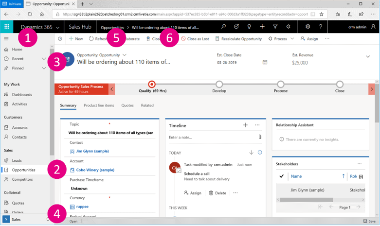
With the imminent October 2018 release, Dynamics 365 users find themselves facing one of the most transformational updates in years. Much like the transition between CRM 2011 and CRM 2013, when the interface transformed from tabs on the left to tabs on the top, we are now back to tabs on the left again! This is all due to the deprecation of the beloved Web interface that has been the default interface for years, and its replacement – the Unified Interface. The new interface is fairly quick to learn and easy to grasp. For end users, the Unified Interface offers a much friendlier and cleaner overall experience. All new organization starting to use Dynamics 365 after September 2018 will have the Unified Interface turned on by default while existing organizations are highly recommended to begin the transition.

Image courtesy Microsoft Dynamics Team Blog
So why are we seeing this transition now? Well, the Unified interface offers CRM users and developer something that has never been available, a single easy to understand that works the same whether accessing CRM data through a web browser, mobile app or through Outlook App. This single interface allows developers to design once and have that interface reflow itself and appear consistent no matter how users access their data.
Right away, you’ll notice a new interface, along with new navigation and a very clean interface. Sitemap navigation is along the left side of the screen and can be opened or closed. When you open a record, instead of needing to scroll to the bottom of a page, you can click on tabs to move around. Subtle uses of color and lines separate sections and fields. Field labels are not cut off if they run on too long. And a new Post control shows Posts, activities, notes all in a single timeline. This timeline can be filtered and sorted based on different dates.
Most of the core functionalities remain similar, but some enhanced capabilities are introduced
-
Timeline Control – allows for better collaboration with your team. The way this is accomplished is by providing a quick way to see the entire communication thread. Along with the new Unified Interface comes the capability to see all of your team’s interactions in a single view. This includes emails, notes, posts, voice attachments, and combined/ custom activities. Enhanced filtering views are also available. With the Unified Interface, you will be able to filter by the type of activities you want to see.
-
Reference Panel– The reference panel is a great way to get work done without having to click out of the screen. You can search for things within the context of the record you are viewing. Reference Panels can be used with all entities in the interface.
-
Navigation – The new menu options allow you to swiftly navigate between the different apps in the system. The navigation in the new interface looks different. You’ll notice some big changes here. You’ll notice that the top navigation bar has had some changes. The sitemap will now be located on the left. Also, the viewports are now larger- to allow more space for toolbars. The breadcrumb trail at the top is now for tracking back to places rather than finding related records. The social pane is now a chronological timeline, which consists of notes, activity types, and posts.
-
Business process enhancement – The business process flow will also be improved. You can now dock the business process stage on your screen- making it easier to stay focused on the task at hand. This is especially helpful when the stage of the business process flow has many complex steps to complete. Business process flows look different. They are no longer open and green, but are now orange and collapsed by default. With the new Unified interface, each stage can now be dropped down to a to-do list (and docked to the right).
-
Reflow – Unreadable elements are no longer an issue- as they’ve been in the past. The app also scales by reflowing components on the screen. More space will be available to display information. The increase in space is due to the responsive design of the app adapting to your screen size. Labels now wrap and sections now adjust to their position.
-
Model Driven Apps – allows for an enhanced end-user experience. You will now be able to scope user experience based on the various jobs that need to be accomplished. Users can have single or multiple apps based on their requirements. To learn more about the model-driven apps, click here.
Ready to begin the transition to the Unified Interface?
It’s time to start planning your migration to the Unified Interface. The experts at enCloud9 are ready to help. Our job is to ensure that you are getting the most out of your Dynamics 365.
At enCloud9, it is our goal to keep you informed on everything Dynamics 365. Visit our blog or our YouTube channel for more news and best practices in Dynamics 365.


